I recently teamed up with director Nicholas Conedera and producer Jack Hooker to shoot the feature film, 'Sharp' (http://sharp-themovie.com/) Sharp is a coming of age dramady that doesn't take itself too seriously. It's funny and entertaining, but still poignant and moving. Terrance Withrow (Played by Nick Nigro), a lazy, stoned-out surfer must adapt to the corporate world and learn how to sell cutlery in order to support his family and get his parents back together after his dad loses his job and walks out on the family.

We had a very healthy 4 week prep time for pre production and Nick and I spent the better part of 2 of those weeks combing through the script scene by scene, tailoring a very detailed shot list for storyboards. This was critical to our success in making all our days on our incredibly tight 22 day shooting schedule with an average of 5 pages/day.

Our camera package was provided through Panavision Hollywood, comprised of a Red Epic-M and Ultra Speed set. We shot red code 5:1 compression at 4K and cropped for 1.85. 5K was considered but I ultimately decided against it so I'd have my true focal lengths and I knew we were going to stay on the wider end of things and the 17.5 vignettes quite a bit with the up-res.


We rated the camera at 800ASA and used IR NDs on our exteriors to drop us down to a T4/5.6. I used 1/4 and 1/2 coral filters on the exteriors to really accentuate the Southern California look (the film takes place in San Diego).

I used a rota pola occasionally and used ND SE horz grads on exteriors to knock down the sky occasionally.

There two very distinct looks in this film; the Sharpco world which is heavily influenced by Wes Anderson and Pop Art. We came up with a manifesto of sorts for these two worlds.


I used a rota pola occasionally and used ND SE horz grads on exteriors to knock down the sky occasionally.


Sharpco:
-- Deeper depth of field (T4/5.6)
-- Deeper depth of field (T4/5.6)
-- Symmetrical compositions
-- One-point perspective
-- One-point perspective
-- Precise movement
-- Camera only moves on X,Y, and Z axis (no diagonals)

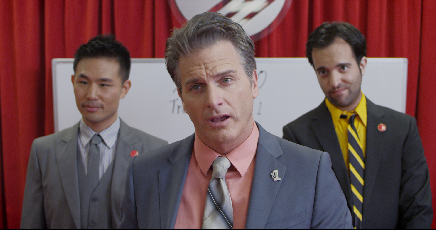
-- Bold, saturate colors, especially red in the production design
-- More head room
-- Wider Lenses (nothing tighter than a 35mm)
-- No diffusion in front of the lens


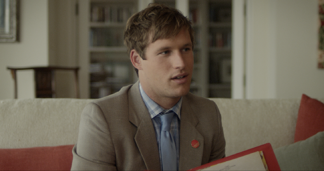
For Terrance's home world, we decided to keep things as grounded in reality as possible.
Terrance:
-- Shallow depth of field (T2+)
-- Asymmetrical diagonals
-- Camera is always handheld, loose, and responsive
-- Shallow depth of field (T2+)
-- Asymmetrical diagonals
-- Camera is always handheld, loose, and responsive
-- Organic shapes, and earth tones in the production design


-- Cooler hues
-- Color temp mixing
-- Tighter headroom
-- Hollywood black magic 1/2 and 1/4
As the film progresses these two worlds begin to mesh together in Act II and III and we experimented with mixing styles.


We rarely used a lens tighter than a 50mm and stayed mostly lensed the actors with 24, 29, and 35mm focal lengths.


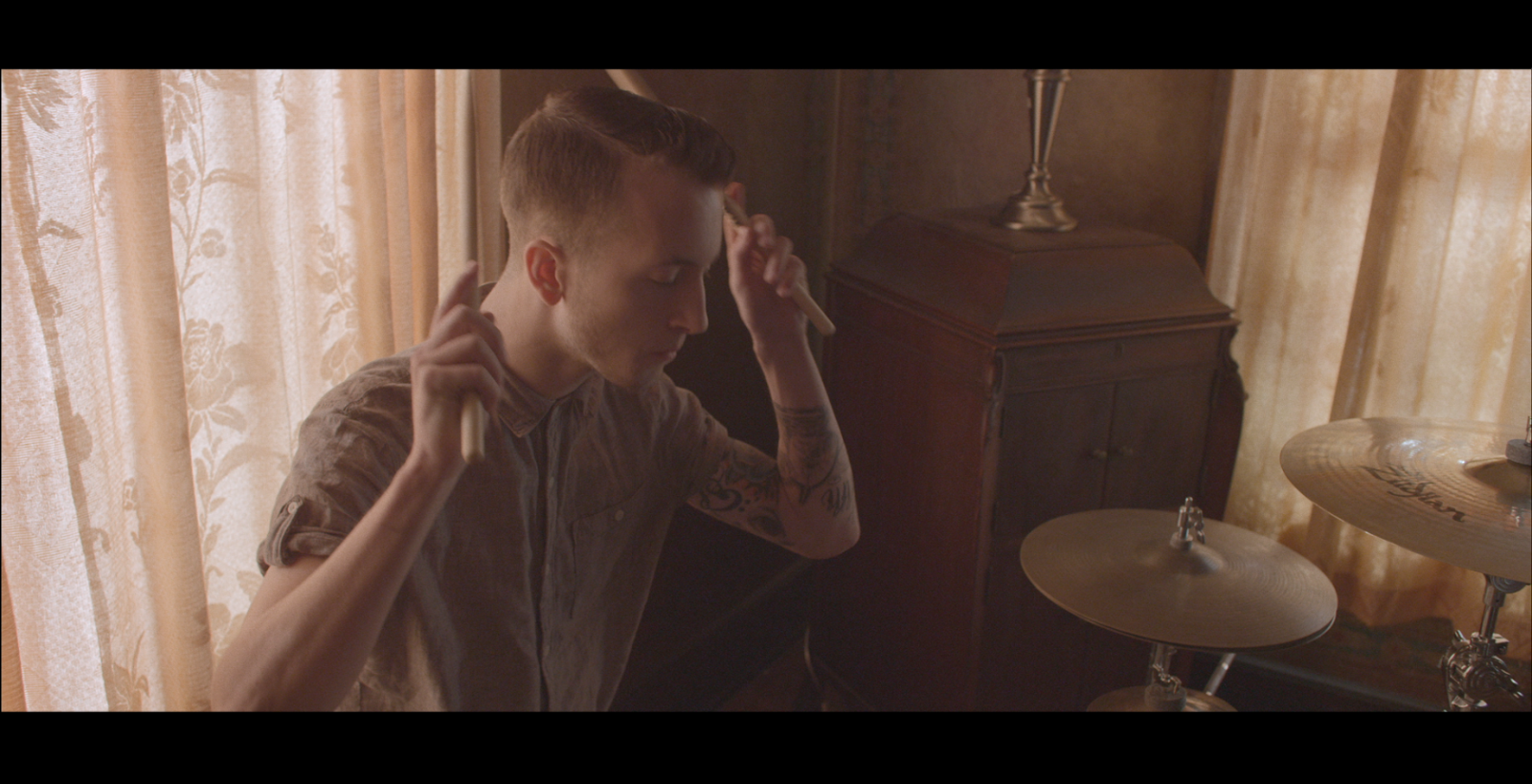
Throughout the film we get deeper and deeper inside Terrance's head and visit his dreams. This was my first time filming underwater and it was a blast despite all the obstacles we had to overcome. We shot all the underwater material over a weekend in Zuma beach area using Hydroflex's Deep Water Epic Rig.

We had to add 2 extension bellows to the rig to accomodate the very large and heavy 17.5mm Ultra Speed (9lbs). This brought the total weight of the rig to 60lbs which became quite the challenge to get the camera completely out of the water past the shallows. We filmed all the underwater at 120fps at 4K.

The director and I went out with our actors into the 55 degree water with nothing more than the rig, 3mm wetsuits, booties, flippers, and mask. None of us were scuba certified but luckily I'm competitive swimmer and can hold my breath for up to 3 minutes and the director is a surfer so we were able to manage quite well out there despite purple lips and numb fingers. I had to be very conscious with my trigger finger because 120fps at 4K gobbles up media! My 1st AC Adam Corriea was a huge help for all the underwork.

Terrance's home is a chaotic, crumbling space so I wanted to go incredibly minimalistic with the lighting and keep things moody and atmospheric.

I wanted it to be cozy and familiar. The location we used is actually the director's house so it was really nice to spend as much time as we did during preproduction at the location, allowing me to see the different looks of the natural lighting throughout the day. We scheduled our scenes based off my notes for the most optimal times to shoot in each room.

For the dinner scene my wonderful gaffer Eric Corriea built a covered wagon with (6) 75w bulbs, dimmed to about 40%, skirted, and diffused with Full Grid. We put all of the living room practicals on dimmers and motivated them with a 650w fresnel with XXS chimeras and multiple layers of diffusion, providing a backlight for Hunter.


I used a dimmed red head in the kitchen bounced into 4x4 bead board for a little background ambience.

The nice thing about shooting in the director's house is he let us screw in wherever we wanted to save time rigging speed rail, a rare luxury for location work. My Key Grip Jordan Black was very pleased. This allowed us to shoot 360, allowing the actors to loosen and improvise which Nick liked to do often.

Dalton's trailer proved to be a very fun challenge because of the very cramped quarters. We lit the scene entirely practically using peanut bulbs for the bottle lights, a 100w photoflood in the green shaded fixture on the table and hid various wattage bulbs around the space to create depth.

We color graded at my house using Da Vinci Resolve, finishing in 2K. 'Sharp' premiers on April 27th at 2PM at the Downtown Independent in downtown Los Angeles. The address is 251 S Main St, Los Angeles. If you'd like to attend you can buy tickets here: http://www.sharpthemovie.


